Why hexagons?
The very first Revontulet mockup — a draw.io file from January 2024, drawn on a phone frame with lorem ipsum in every cell — had one strange thing in it: the home screen was a honeycomb. Seven coloured hexagons, one per day. Two years and three redesigns later, it's still there. This post is about why it refused to die.
Calendars lie about rest days
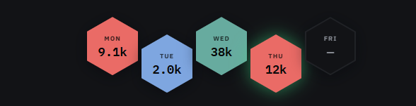
A week view built from rows makes every day the same size and the same shape — Monday's interval session and Friday's nothing get identical rectangles. That's how spreadsheets think, not how training feels. In a honeycomb, a rest day is still a cell — present, structural, holding its neighbours in place. Which is exactly what a rest day does in a training plan.
A rest day is not an empty rectangle. It's the wax between the honey.
Tessellation is the point
Hexagons are the most efficient shape that tiles a plane — bees figured this out before we did. Practically, that means seven sessions pack into a strip that reads left-to-right like a sentence: intervals, swim, ride, trail, rest, long ride, rest. When the viewport shrinks, the strip folds into a cluster instead of a scrollbar. The mockup drew it as a cluster from day one; the web version treats the strip as the desktop luxury and the cluster as the truth.
Colour does the counting
Each discipline owns a colour — the same coral, sage and steel blue that were in the original mockup's palette, promoted to design tokens. Scan the strip and you know your week's balance before reading a single number. Three coral cells in a row? You've been running too much. The hexagons are a chart pretending to be navigation.
What we gave up
Hexagons are terrible at holding text — you get a day label, one number, one word. That constraint turned out to be the feature: the mosaic shows shape of the week, and one click opens the session with every lap and zone. Summary up top, truth underneath. The spreadsheet view still exists — it's called Calendar, one item below in the sidebar — but the honeycomb is the front door.